Your event website is the digital front door to your brand — and in 2025, it’s expected to do far more than display dates and details. A great event website design captivates attention, communicates value, and converts curiosity into commitment.
According to Bizzabo’s 2025 State of Events and Industry Benchmarks Report, 71% of attendees say a well-designed website influences their decision to register, and 73% expect events to include modern digital experiences before they even arrive.
So what does an exceptional event website look like in 2025? It’s immersive, intuitive, and built for engagement; reflecting the same creativity and connection attendees expect on-site.
What you’ll learn:
- The latest event website design principles that boost engagement
- Common mistakes to avoid
- Real event website examples that inspire action
- Practical event website best practices for balancing creativity and conversion
Design principles that make event websites shine
1. Prioritize clarity over complexity
Your hero section should answer three questions at a glance:
- What is this event?
- Why should I care?
- How can I join?
Concise headlines, bold CTAs, and streamlined navigation outperform over-designed pages. Use a clean hierarchy, one primary action (register, learn more, or apply) per screen.
2. Design for accessibility and inclusivity
Accessible design isn’t optional. In 2025, contrast ratios, keyboard navigation, and screen-reader compatibility aren’t just compliance, they’re credibility.
As Bizzabo’s Designing In-Person Events That Deliver notes, inclusivity is now a defining marker of great experiences, both online and off. Accessible design also boosts SEO performance and user trust.
3. Use interactivity with intention
Interactive elements like countdown timers, personalized agendas, or subtle motion can enhance engagement, but only if they serve a clear purpose. Lightweight AI-driven personalization (such as recommending sessions based on browsing behavior) is becoming a norm for top-tier event sites.
4. Tell stories through visuals
Your site should make visitors feel something. Use photography, short video clips, and authentic imagery to connect emotion with anticipation. Feature real attendees, speakers, and behind-the-scenes moments to build trust through transparency.
5. Optimize for mobile-first discovery
More than 65% of event website traffic now comes from mobile. That means single-scroll layouts, responsive CTAs, and compressed visuals are must-haves for both UX and SEO.
Beautiful event website examples for inspiration
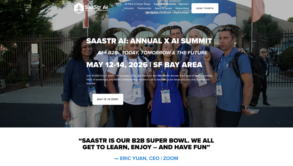
1. SaaStr Annual
SaaStr’s event website delivers clarity from the first scroll: “SaaStr AI: Annual x AI Summit.” The headline captures focus, the visuals convey innovation, and the navigation guides visitors through essentials; dates, location, and registration.
Key takeaway: Lead with focus. Communicate your event’s “why” before the first scroll. Every design choice should serve clarity and conversion.
2. INBOUND by HubSpot

HubSpot’s INBOUND event site is a masterclass in motion-driven storytelling. Its video backgrounds and subtle animations create an immersive experience that feels dynamic yet intentional.
Key takeaway: Great design is kinetic. When movement tells a story, it reinforces emotion and brand personality.
Explore Bizzabo Studios
For deeper inspiration on digital storytelling, explore Bizzabo Studios — where experiential creativity meets performance strategy.
3. TechCrunch Disrupt

TechCrunch Disrupt’s minimalist black-and-white palette balances accessibility and modernity. High contrast, consistent CTAs, and predictable navigation deliver an intuitive user experience across devices.
Key takeaway: Accessibility is strategic. It broadens reach, strengthens SEO, and signals professionalism — core attributes of high-performing event websites.
4. Bizzabo Webinars

Bizzabo’s event websites reflect seamless brand continuity. The familiar design language, typography, layout, and tone, mirrors the product experience. Visitors encounter clear pathways: watch on demand, register, or explore the session agenda.
Key takeaway: Cohesion builds trust. When your event site mirrors your brand ecosystem, it reinforces credibility and drives repeat engagement.
5. Dreamforce by Salesforce
Dreamforce transforms its homepage into a cinematic experience. Video banners, skyline imagery, and attendee moments tell a story of innovation and community.
Key takeaway: Storytelling transforms browsing into belonging. When visitors can see themselves at your event, conversion follows naturally.
6. Web Summit

The Web Summit’s modular layout blends simplicity with authority. Scrolling reveals logical sections; speakers, agenda, and social proof, that flow intuitively.
Key takeaway: Design for comprehension before conversion. Simplicity helps visitors understand faster, reducing drop-off and boosting registrations.
7. TED Conferences

TED Conferences website is the definition of minimalist excellence: white space, bold typography, and confident red accents. The result is focus without distraction.
Key takeaway: Simplicity signals strength. When your mission and message are clear, your design doesn’t need embellishment.
How to build a high-impact event website
The design tactics the sites above use can be replicated and implemented into your own event website. Here are a few key takeaways that you can use for your event website and event marketing strategies:
- Align color, typography, and imagery with your event theme and brand identity.
- Be concise. Embrace whitespace and let visuals speak.
- Anticipate attendee questions (What’s in it for me? Where is it? How do I join?) and make answers instantly visible.
- Use authentic photos or videos from past events to spark connection.
- Keep key details (date, time, venue, and format) visible in your header.
Bizzabo’s Maximizing Event ROI Guide
For a deeper look at how great design drives measurable outcomes.
In 2025, beautiful event websites don’t just inform, they immerse. They reflect your event’s purpose, showcase its personality, and convert curiosity into participation.
Ready to create an event website that inspires and performs? Request a demo to see how Bizzabo helps you design stunning, high-converting event sites built for 2025 and beyond.
Frequently asked questions about event website design
The hero section. It’s your first impression and key conversion point. Keep messaging clear, visuals strong, and CTAs action-oriented.
Continuously. From pre-event announcements to post-event recaps, your website should evolve with your event lifecycle.
Platforms like Bizzabo combine registration, analytics, and CMS tools in one place, allowing event leaders to design, optimize, and measure performance with ease.
👇Follow more 👇
👉 bdphone.com
👉 ultractivation.com
👉 trainingreferral.com
👉 shaplafood.com
👉 bangladeshi.help
👉 www.forexdhaka.com
👉 uncommunication.com
👉 ultra-sim.com
👉 forexdhaka.com
👉 ultrafxfund.com
👉 bdphoneonline.com
👉 dailyadvice.us